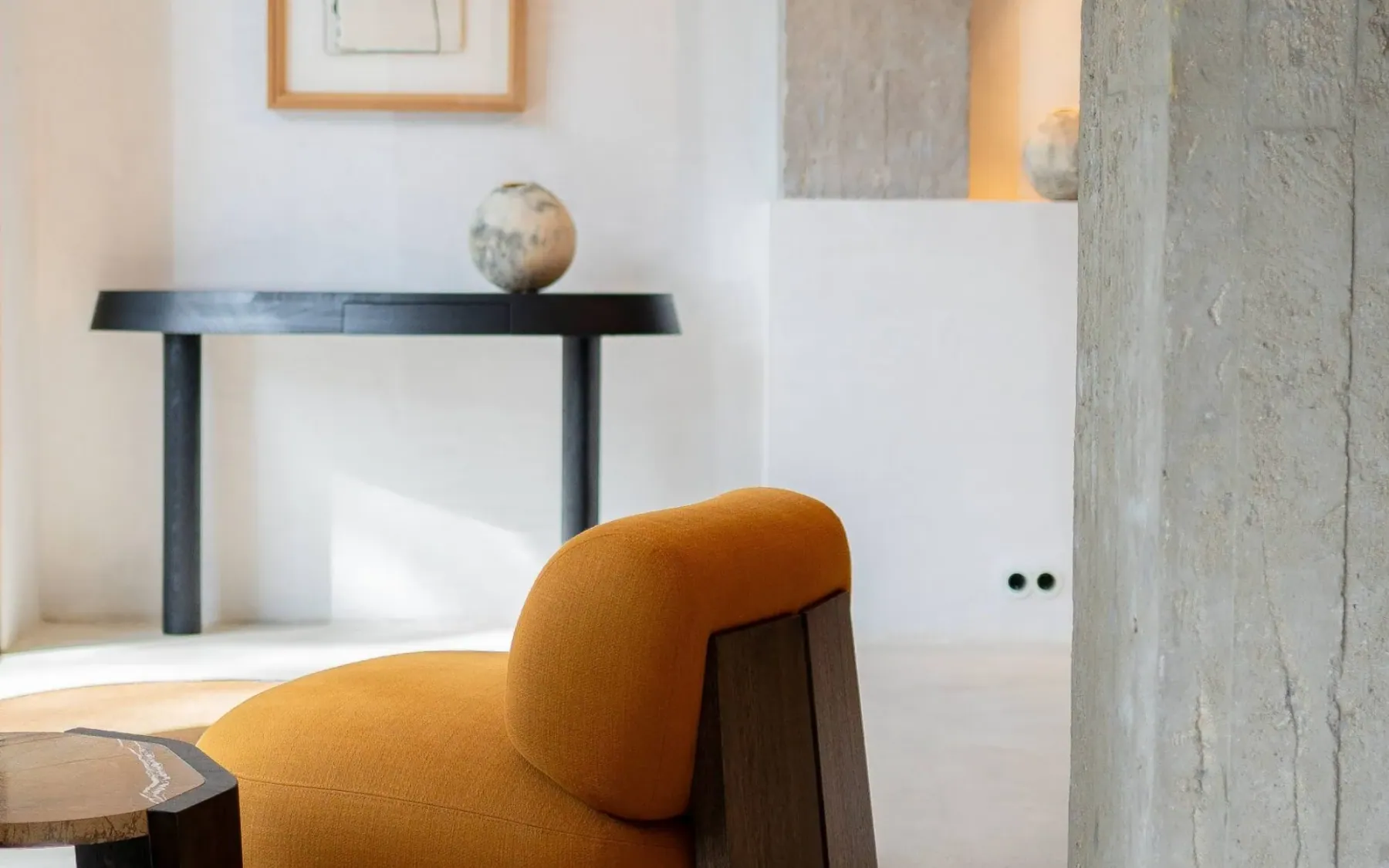
Espai Rö is a showroom and architecture studio in Barcelona, founded in 2010 by architects David Sánchez and Efrem López. Its collection spans thirty-nine houses — Abimis, Agape, Baxter, De Castelli, Edra, Giorgetti, PP Møbler, Wittmann among them — across eight categories.
The site had to carry that collection without flattening it into a grid of products. The rooms, the materials and the gaps between objects are the point. So the brief was not a catalogue with better photography. It was a visit.
A room, not a catalogue
Most furniture platforms are built to answer a filter. This one is built to reproduce a visit: the light, the sequence, the pause in front of a piece. There is no cart and no checkout anywhere on the site. Enquiry is a conversation, opened by email or a phone call.
That rule set the constraints. Every brand needed enough room to keep its own visual language, and the whole collection needed one continuous rhythm. It also had to be editable by the studio, in two languages, without a developer in the loop.
One surface, thirty-nine rooms
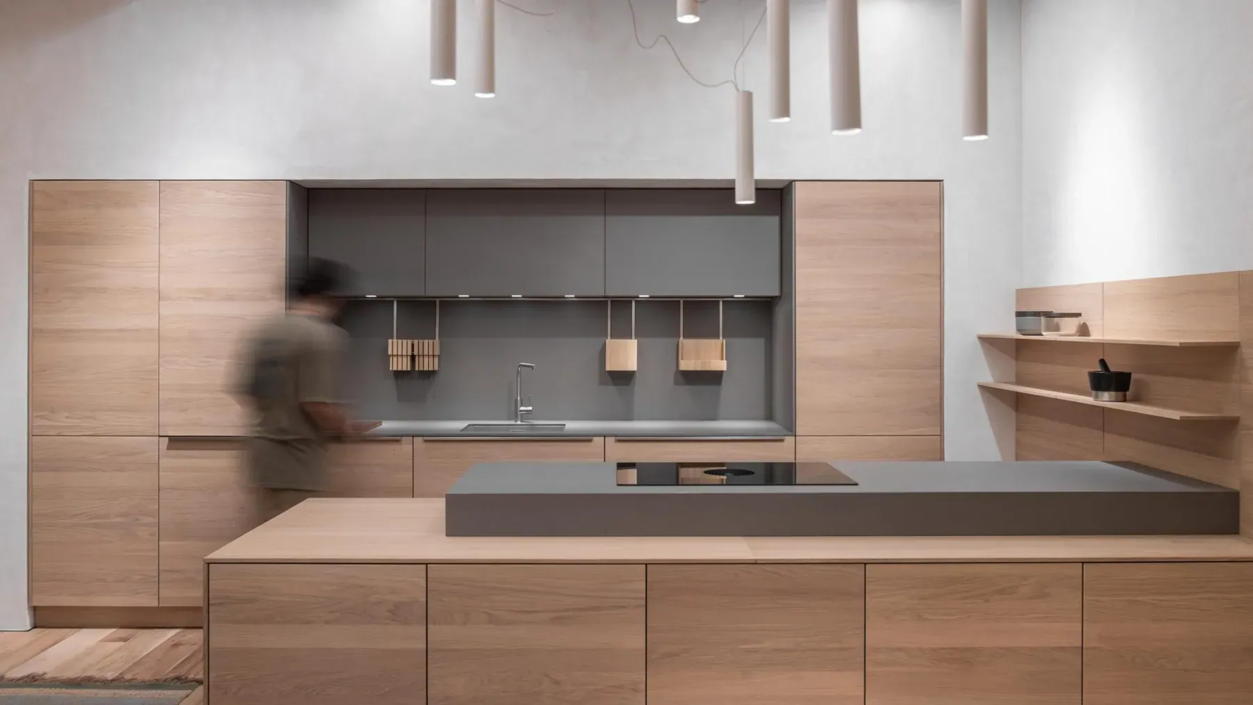
Brands are not thirty-nine separate templates. Each is a panel inside one continuous browsing surface: full-bleed photography on one side, the brand's story and enquiry on the other, categories held in the margin. The layout stays still; the images and the voice change. That is what makes the collection read as one showroom rather than a directory.
We implemented Positive Design's layouts in Next.js across desktop and mobile — the vertical navigation, the image sequences, the transitions between brands. Content sits in headless WordPress: brands, categories, projects and page copy are edited there and delivered to the front end. Spanish and English are first-class routes, not a toggle bolted on at the end. The site runs on Netlify.
- Split-screen brand panels with per-brand image sequences
- Vertical, margin-held navigation that stays out of the photography
- Headless WordPress content model for brands, categories, projects and page copy
- Bilingual ES / EN routing from day one
What we delivered
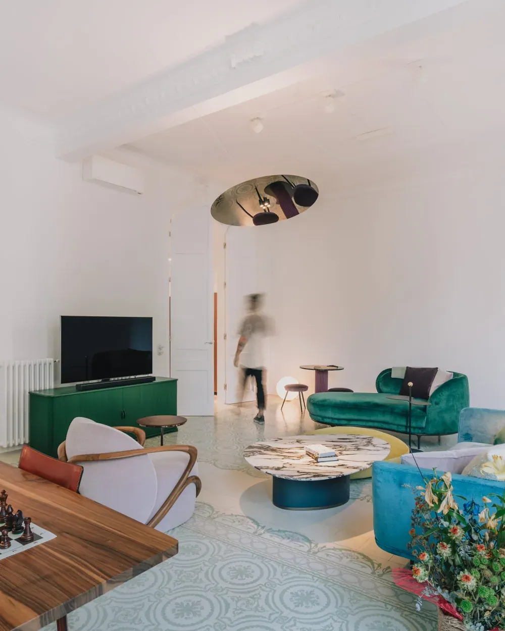
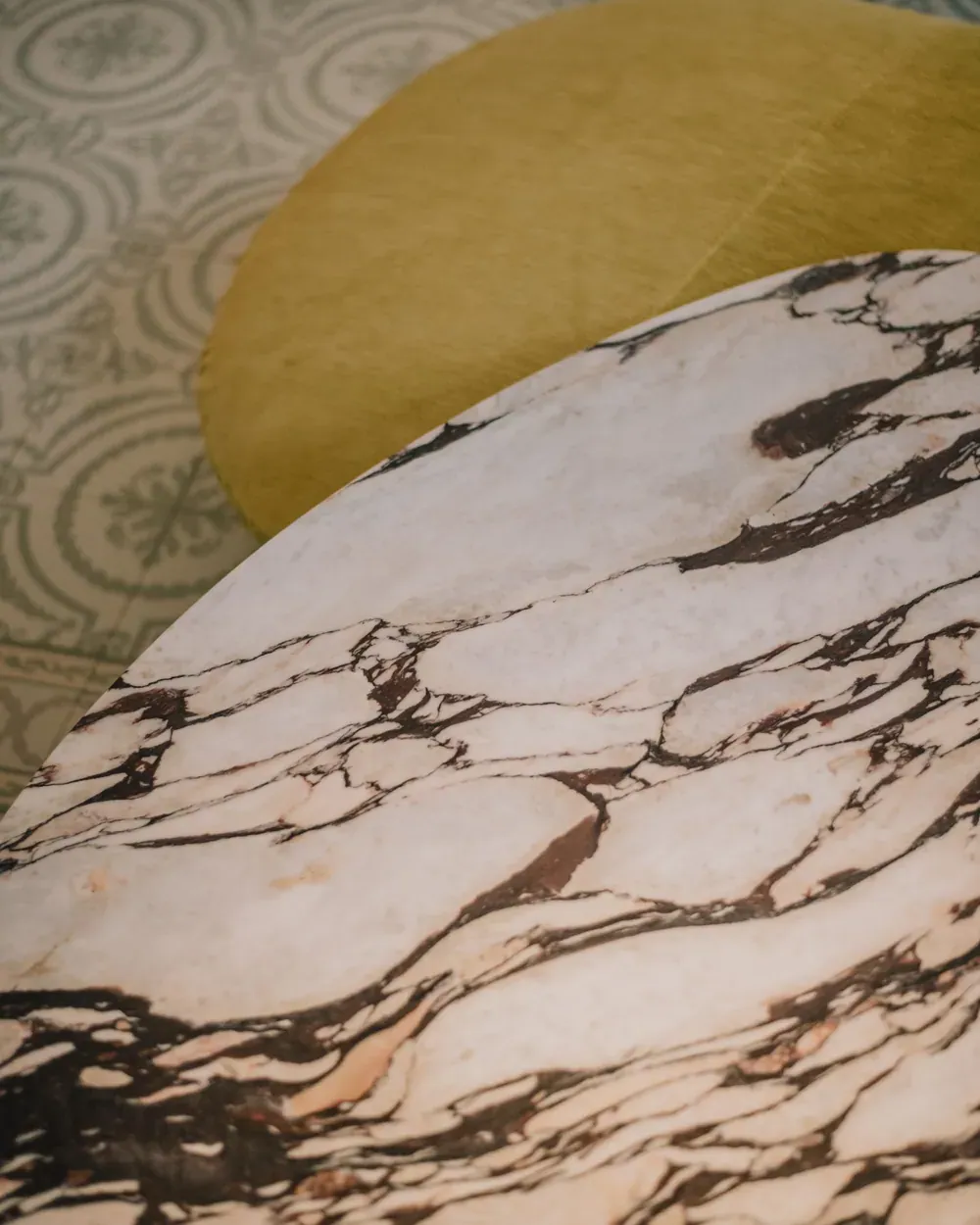
A platform that behaves like the room it represents: quiet, visual, unhurried. The studio publishes new brands and projects through WordPress; the design holds because the templates hold. Nothing on the page competes with the object being looked at.
- Design implementation across breakpoints — split screen, vertical nav, image sequences, transitions
- Thirty-nine brand panels and eight categories on one browsing model
- A headless WordPress the studio can edit without touching code
- Bilingual ES / EN routes, served from the same content model
The houses, in full
Abimis · Agape · Atelier Février · Baxter · Baxter Outdoor · Bert Frank · Bora · Cassina · Ceadesign · Davide Groppi · De Castelli · Dedar · Dedon · Edra · Falper · Gaggenau · Giorgetti · Glas Italia · Gloster · Haberdashery · Lambert & Fils · Loro Piana · Mingardo · Moroso · Nic Design · Overgaard & Dyrman · Paola Lenti · Perrin & Rowe · PP Møbler · Quooker · Röthlisberger Kollektion · Siemens · Team 7 · Thut Möbel · Unox Casa · Van Rossum · Vaselli · Viabizzuno · Wittmann